
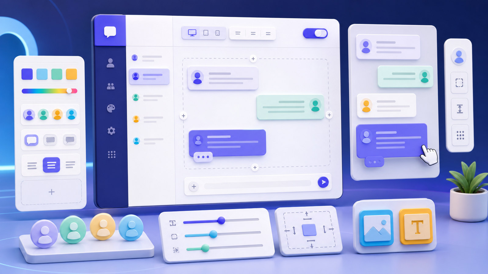
Customizing a chat simulator is not a matter of changing every color, avatar, and spacing control. The visual system should support a specific content task. A chat example for a course handout needs strong reading order and print clarity. A product demonstration should emphasize the steps. A storytelling scene needs to make character voice and pacing easy to follow.
This guide explains how to plan a custom chat mockup through information structure, component rules, responsive layout, and responsible publishing. Identify every interface as a fictional demonstration or design mockup. Do not copy private conversations, impersonate people, companies, or official accounts, or present generated images as evidence of transactions, promises, reviews, or events.
1. Write a use statement before opening style controls
Describe who will view the result, where they will view it, and what they should learn. For example: “New employees will read a six-message handoff example on a projector.” That sentence determines type size, width, contrast, and message count. Customization without a use statement often produces something attractive but difficult to read.
Choose the delivery format as well: web preview, mobile image, presentation slide, printed material, or video frame. The same conversation needs different line lengths and margins at different sizes. Do not build one extremely long canvas and expect shrinking to solve every channel.
2. Separate the content model from the visual theme
The content model contains participants, messages, time, state, and media. The visual theme contains fonts, color, corner radius, shadow, and background. Complete the content model first and apply a theme second. This prevents the need to imitate a particular platform from weakening the information. Keep an unstyled script so the conversation can move to another layout or language later.
- Participants: use fictional names and original or licensed avatars;
- Messages: give each message one main intent;
- Time: show it only when sequence needs clarification;
- Status: sent and read markers must not imply real activity;
- Media: use assets you may publish and write alt text for important images.
3. Build a small, stable token system
Instead of adjusting every component separately, define a few reusable rules: page background, primary text, secondary text, outgoing message color, incoming message color, a spacing unit, and corner-radius levels. A limited palette is easier to keep consistent and easier to test for contrast.
Typography needs at least three levels: heading, message copy, and supporting metadata. Message text must be readable at the final exported size, not only while the editor is zoomed in. Time and state labels may be smaller, but they must remain legible. Decorative fonts do not work well for long messages.
4. Choose platform-inspired patterns, not an official replica
Writers often need to communicate the idea of a group chat, direct message, or community thread quickly. Common patterns such as left-right messages, avatar lists, reply quotes, and date dividers can be useful. Avoid copying trademarks, official icons, proprietary interface language, or a highly similar sign-in screen. Use accurate descriptions such as “platform-inspired,” “chat prototype,” or “simulated interface.”
If a scenario names a third-party service, state clearly that the tool is independent and is not affiliated with, sponsored by, or endorsed by that service. Trademarks belong to their respective owners. The disclosure helps readers understand the educational and demonstration context.
5. Mini case: customize a course-feedback conversation
Imagine an instructional designer showing a fictional exchange in which a student does not understand an assignment. The goal is to make the problem, clarification, and next action readable on a projector. The designer chooses a neutral light background, dark body text, and two distinguishable message colors. Unnecessary presence indicators are removed, while one useful date divider remains.
Version one uses eight colors, three shadow styles, and tiny timestamps. There is too much visual competition. Version two reduces the system to a background, two message colors, and one accent. Messages stay between two and four lines. A clarification is labeled in words rather than color alone. The output no longer tries to look like a real screenshot; it becomes a clearer teaching image.
The caption identifies it as a fictional course example. Participants use generic names and original avatars, and the image contains no real school, student record, or grade. Ordinary-looking material still should not be copied from a private chat.
6. Review mobile, desktop, and exported images separately
Responsive design is more than scaling. Mobile layouts need shorter lines and fewer side-by-side elements. Desktop layouts can provide more context, but the primary exchange should remain focused. At every size, check whether avatars squeeze the text, time labels wrap, long words or URLs overflow, and the final message is cropped.
After exporting a PNG or JPG, open it at the width used in the article. If a reader must zoom to understand it, reduce the content, increase type size, or divide the material into two images. A high-resolution file does not repair a weak layout.
7. Make the custom interface accessible
Check text and background contrast. Do not distinguish speakers only through red versus green or left versus right. Add readable participant names and write alt text that describes the scene, participants, and purpose instead of saying only “chat screenshot.” An animation or typing indicator should never be the only clue needed to understand the conversation. For long articles, a text version can complement the image.
8. Control realism so the mockup cannot mislead
The more polished the interface becomes, the more important the simulation disclosure is. Do not add real verification marks, payment statuses, order receipts, official notices, or apparently verifiable times and locations. For disputes, public figures, public events, or sensitive health and financial topics, use a neutral fictional case or do not generate the image.
Let the title, caption, and page context all communicate that the work is a prototype. A small disclaimer in a corner cannot correct an image deliberately designed to function as false evidence.
9. Finish with a consistency test
Check that every participant keeps the same avatar, name, message direction, and color. Verify date order and reply relationships. Review Chinese punctuation, English capitalization, and time-zone language. Then ask a person unfamiliar with the project to view only the image and explain who is speaking, what the problem is, and what happens next. If they cannot, revise information structure before adding decoration.
Common questions
Does more customization create better SEO?
No. Search value comes from original, complete copy that solves a real question. A customized interface helps only when it improves understanding.
Can I reproduce a chat application exactly?
Use generic, platform-inspired patterns and avoid trademarks, official assets, and language that suggests an official relationship.
How many colors does a theme need?
Many article examples need only a neutral background, two message colors, and one accent. Meet contrast requirements before adding style.
Pre-publishing checklist
- The use, audience, and delivery dimensions are defined;
- The content model and visual theme remain independent;
- The number of color, type, and spacing rules is controlled;
- Mobile, desktop, and final export sizes have been reviewed;
- Participants and assets are fictional, original, or authorized;
- No real verification mark, receipt, or evidence-like detail appears;
- Alt text accurately identifies the image as a simulation or prototype;
- Chinese and English copy read naturally and keywords appear only where useful.
An effective custom chat simulator is not an unlimited collection of options. It is an explainable design system. When every choice answers “How does this help a reader understand the conversation?”, the result can be clear, original, and responsible at the same time.