
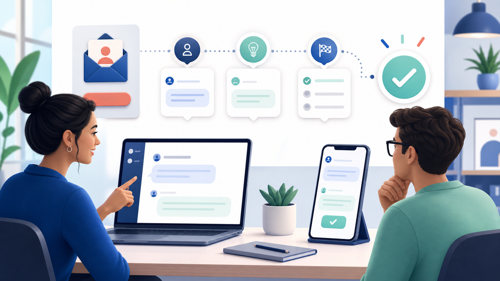
A good onboarding conversation does not try to explain an entire product in one session. It helps a new user understand where they are, why one next step matters, and how to recover if they get stuck. This case study uses a fictional team workspace called Northstar and a fictional new teammate named Mina. No real company, customer, account, or performance result is represented.
The scenario has one outcome: Mina accepts an invitation and creates a first project note. The chat mockup is a design and training example, not a customer testimonial. It demonstrates information order, wording, pacing, and support choices that a real product team could test with appropriate users before implementation.
You can reproduce the visual sequence in the Chat Simulator editor using fictional identities, chronological timestamps, playback, and a Mobile or Web export.
1. Define the first meaningful outcome
The first task should demonstrate real product value without requiring a long setup. In this example, creating a project note is small enough to complete in a few minutes, but meaningful enough to show where shared work will live. Asking Mina to configure every preference, invite several people, import data, and select a paid plan would create unnecessary cognitive load.
A useful outcome is observable. The team can confirm whether the invitation opened correctly, whether the workspace name was understandable, whether Mina found the note control, and whether the saved result appeared where expected. These observations are more useful than a vague goal such as “make onboarding engaging.”
- Choose one task that reflects the product’s core value.
- Make the task reversible or low risk for a new user.
- Avoid requiring optional profile data before the task.
- Define what successful completion looks like.
2. Establish the fictional case context
Mina receives an invitation from Jordan, a fictional team lead. The invitation states the workspace name, who sent it, and what accepting will allow. It does not claim that access will expire in minutes or that colleagues are waiting unless those statements are actually true in the implemented product.
The mockup uses abstract avatars and invented names. It contains no real email address, organization, project title, invite token, analytics identifier, or private document. A label such as “fictional onboarding example” should appear in the article or asset caption when the image is published outside this tutorial.
3. Write the core message sequence
The sequence begins with orientation, moves to one action, provides a short explanation, and closes with confirmation plus an optional next step. The product helper speaks in a concise, functional voice. Jordan appears only where human context is useful; the mockup does not pretend that a real colleague is sending automated messages.
The following lines are sample copy for this fictional case. They are deliberately plain so a reader can understand the flow without relying on animation or decorative styling.
- Jordan: “I invited you to the Northstar workspace so we can keep project notes in one place.”
- Product helper: “You are joining Northstar. You can review the workspace name before continuing.”
- Mina: “Join workspace.”
- Product helper: “Start with one note. Choose a title and add a short next step; you can edit or delete it later.”
- Mina: “Created: Launch questions.”
- Product helper: “Your note is saved in the project area. You can stop here or open the optional two-minute tour.”
4. Explain why each message exists
The first message provides human context. The second verifies destination and reduces the risk of joining the wrong workspace. The task instruction explains both the action and its reversibility. The confirmation says where the result went instead of displaying a generic celebration with no practical information.
The tour is optional and appears after success. This respects users who already understand the interface while still helping those who want more guidance. The wording avoids guilt, artificial countdowns, and claims that completing more steps will guarantee productivity.
5. Design useful recovery paths
A complete mockup should include at least one problem state. The invitation may already be used, the workspace may not be recognized, or the note may fail to save. Error copy should describe what happened, what data was preserved, and what the user can do next.
Do not blame the user or hide support behind repeated retries. If an administrator must send a new invitation, say so. If the user can copy their unsaved note before refreshing, make that option visible.
- Invitation expired: explain who can issue a new one.
- Wrong account: allow the user to review or switch identity.
- Save failed: preserve the draft and offer a safe retry.
- Permission missing: state the required role without exposing private workspace details.
6. Check accessibility and reading pace
Names and roles should be distinguishable without color alone. Use visible labels, consistent alignment, and sufficient contrast. The primary action needs a descriptive label such as “Join Northstar workspace,” not a vague “Continue” when the destination matters.
During playback, leave enough time to read the workspace explanation and recovery guidance. Provide the same essential information as selectable page text when the mockup is part of a tutorial. Motion should support the sequence, not become the only way to understand it.
7. Review the case with practical evidence
A small usability review can ask participants to explain where they are joining, complete the note, and identify how to get help. Measure completion and comprehension separately. A fast completion is not successful if participants misunderstand who invited them or where the note was stored.
Document the device, viewport, participant context, and test limitations. Do not invent conversion statistics for a mockup. If real metrics are later collected, describe the sample and method rather than turning one result into a universal promise.
- Could the participant identify the workspace and sender?
- Did the participant understand the first task before acting?
- Could the participant recover from an error?
- Did the participant know the tour was optional?
8. Privacy and disclosure checklist
Onboarding examples often tempt creators to reuse a real invitation because it already looks convincing. That creates avoidable privacy and security risk. Build the example from scratch and never display active links, tokens, customer domains, employee email addresses, internal project names, or analytics identifiers.
When publishing the image, state that it is a simulated product concept. Do not present Mina’s successful task as proof that a real customer adopted the product, and do not imply endorsement by an unrelated platform.
Frequently asked questions
Should the first task always be the easiest feature? Not necessarily. It should be the smallest task that demonstrates meaningful value for the intended user. Can the flow include plan selection? Yes, when payment is genuinely required at that stage, but price, renewal, trial, and cancellation information must be clear before commitment. Should the mockup look exactly like the production interface? It should reflect the concept being tested, but it must be labeled as a concept if the final product differs.
Final case checklist
- One first outcome is defined and measurable.
- All identities and workspace details are fictional.
- The action, destination, and reversibility are clear.
- Errors have honest recovery instructions.
- Optional guidance is not presented as mandatory.
- The exported asset is readable and labeled as simulated.